WordCamp Asia’s design team consists of three members: Boy, the team lead, is a graphic designer from Thailand. Junko is a web designer and photographer from Japan. The last team member is Daiya, a digital marketer from Hong Kong. One of the key task for the team is to design a brand identity that will set the tone for WordCamp Asia going forward.
In designing the brand identity for Asia’s first flagship WordCamp, the team understood the importance of starting right; the identity has to be able to represent the unique diversity of Asia, considering that each Asian country has its own distinct culture, language, writing system and colours. It is, by all means, not an easy task! In short, WordCamp Asia’s brand identity must be:
- Distinct and unique from other regional, flagship, and local WordCamps
- Represent Asia as a whole, not just a particular sub-region or country
- Can be easily customized to reflect the current host city (in this case, Bangkok)
- Consider and respect WordCamp and WordPress chapter meetup logo guidelines
The design approach by the team is to separate the identity into 2 parts; logomark, and logotype + key visual
- WordCamp Asia Logomark – The logomark will be the “constant” part of the identity. This logomark is intended to create brand awareness, keep consistency and continuity of WordCamp Asia going forward. Therefore, it has to be simple, memorable, and versatile.
- WordCamp Asia 2020 Logotype & Key Visual – This is the “customizable” part of the identity. It is intended to be refreshed every year, and it should also reflect the unique flavour, attractiveness, and style for the current host city. For WordCamp Asia 2020, the theme will be about the city of Bangkok.
With that decided, our design team started to work!
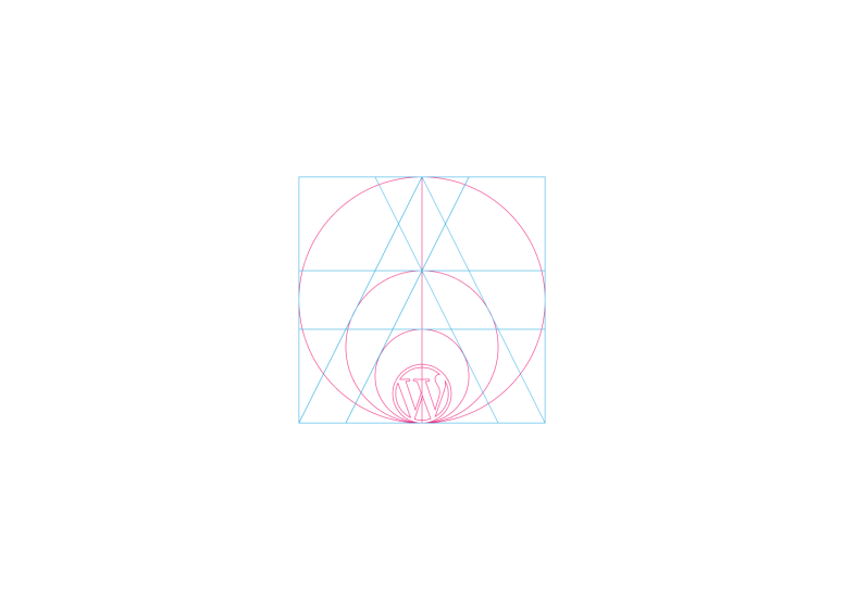
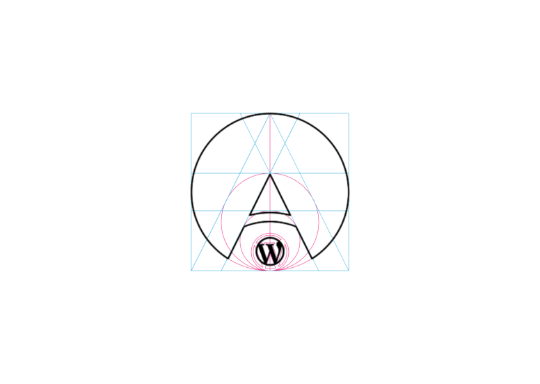
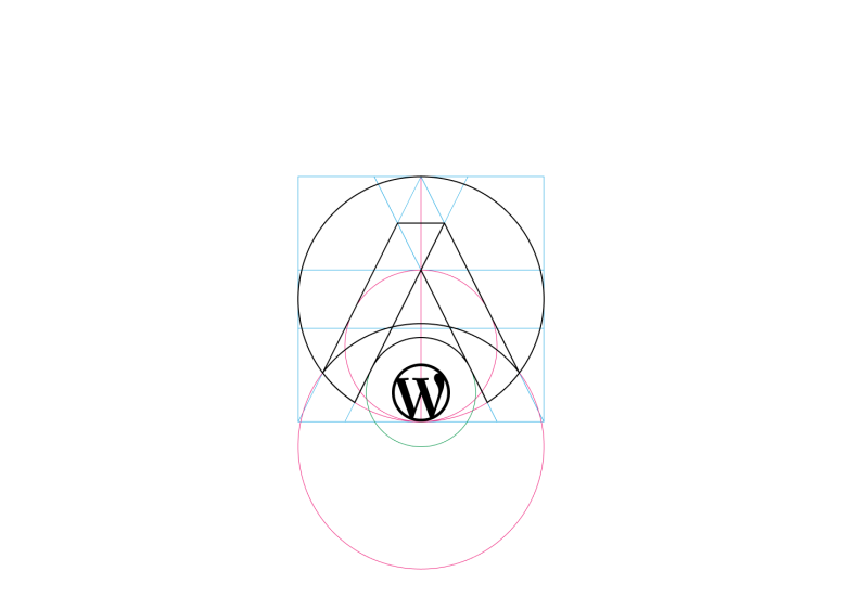
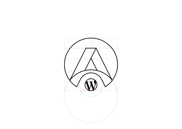
Part 1: Designing the Logomark
After defining the key messages that need to be conveyed through the logo, the design team brainstormed together and experimented with various ideas: maps element, sunrise, combinations of maps and letters, fabric patterns, languages, and even 4 seasons in Asia.
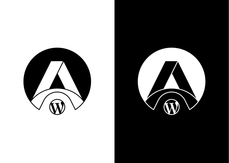
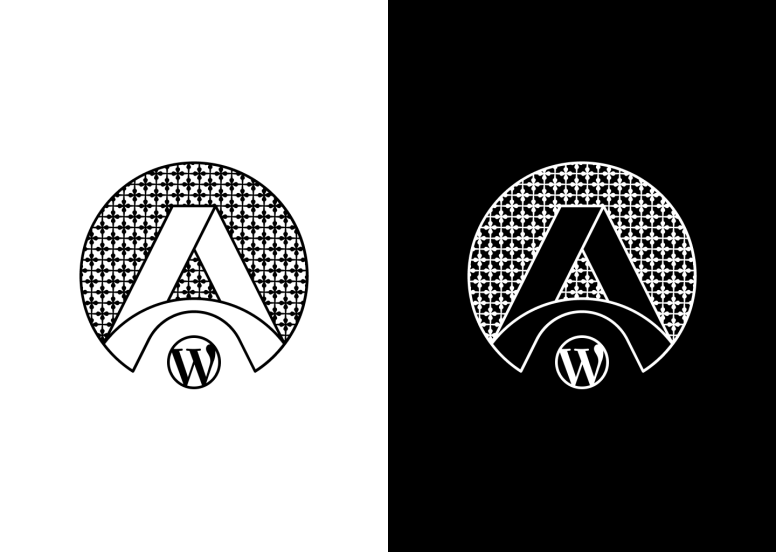
The design team then decided to bring several of these reiterations to the rest of the organizers and the majority voted for Junko’s idea of “Circle and bridge with ‘A’ motif (A from Asia). The organizers also gave some valuable feedback to the design team.

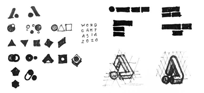
A is the first letter of the alphabet and triangle shape is similar to ‘人’ in Chinese that means ‘people’, and it represents the ‘camping tent’ too, which suits the name of WordCamp. It’s the perfect element to be included in the logo!
The logomark iterations went on and it finally found the sweet spot for communicating the team’s initial idea mixed with Daiya’s idea about chaos, variety, and diversity in Asia that the team agreed.
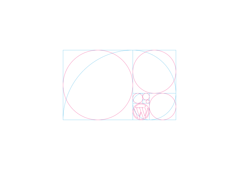
The reiteration process was done numerous times over a few weeks, but the process is summarized here by Boy, the design team lead:

Part 2: Designing 2020 Key Visual and Logotype
After the logomark is finalized, the design team started on the next part of the identity: the key visual and logotype, which also includes the colour scheme. Since Boy (the team lead) is from Thailand and is currently residing in Bangkok, the design team endorsed Boy to be in charge of designing the key visual that has and reflects the attractiveness, unique flavour, and appeal of Bangkok.
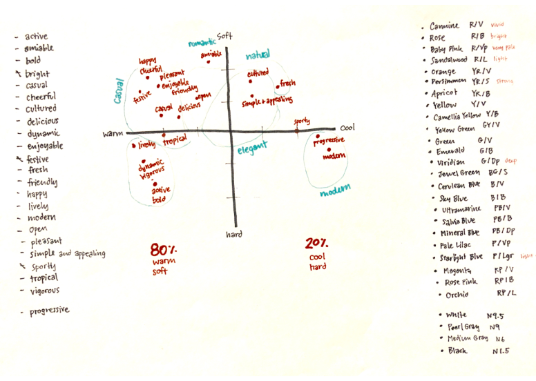
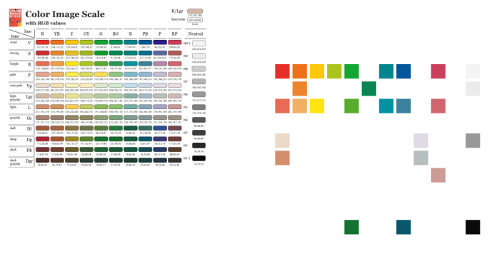
Boy first started with defining the colour scheme, as colour is an important element that dictates the overall mood of a design. His approach is systematic, as you can see from the steps that he described below:
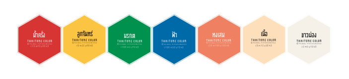
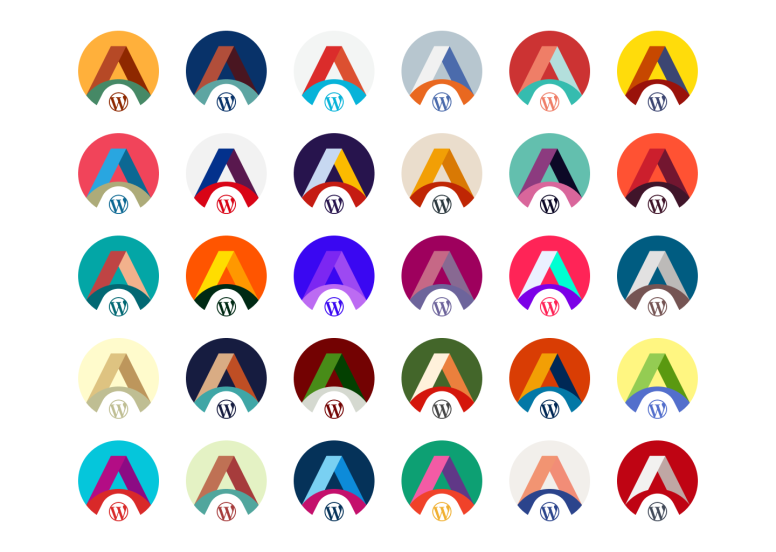
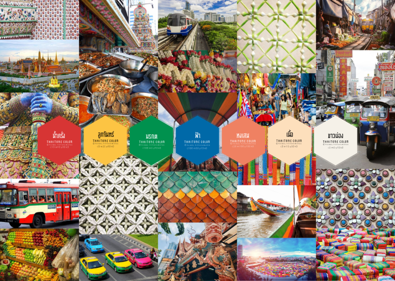
Most of the upcoming WordCamps limit the colours to only 2 colours, but as this is our region’s first WordCamp, the design team felt that we can have more colours to make it more attractive and show more of Asia’ diversity.
For the primary colour, RED was chosen by the team, as red is a colour of passion (it’s hot and spicy, just like Thai weather and cuisine) which suits Bangkok and Asia in general perfectly!
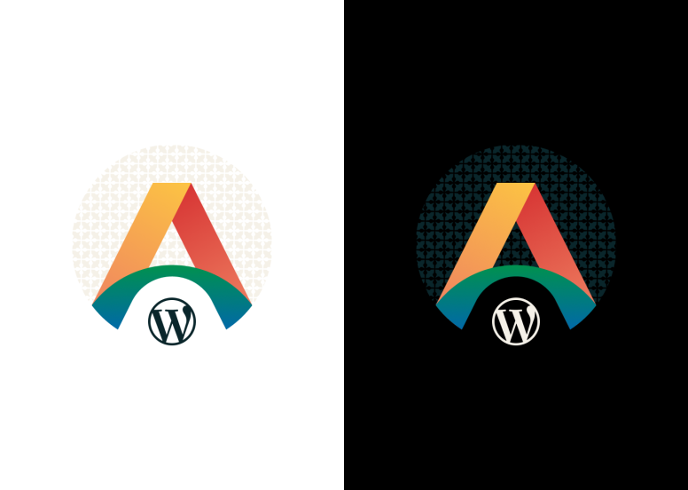
The colours are then applied to the logomark, and here we have the result:
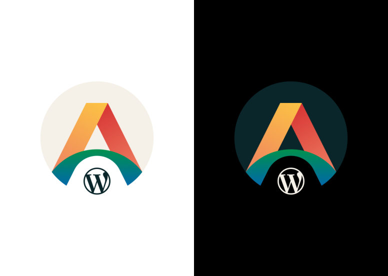
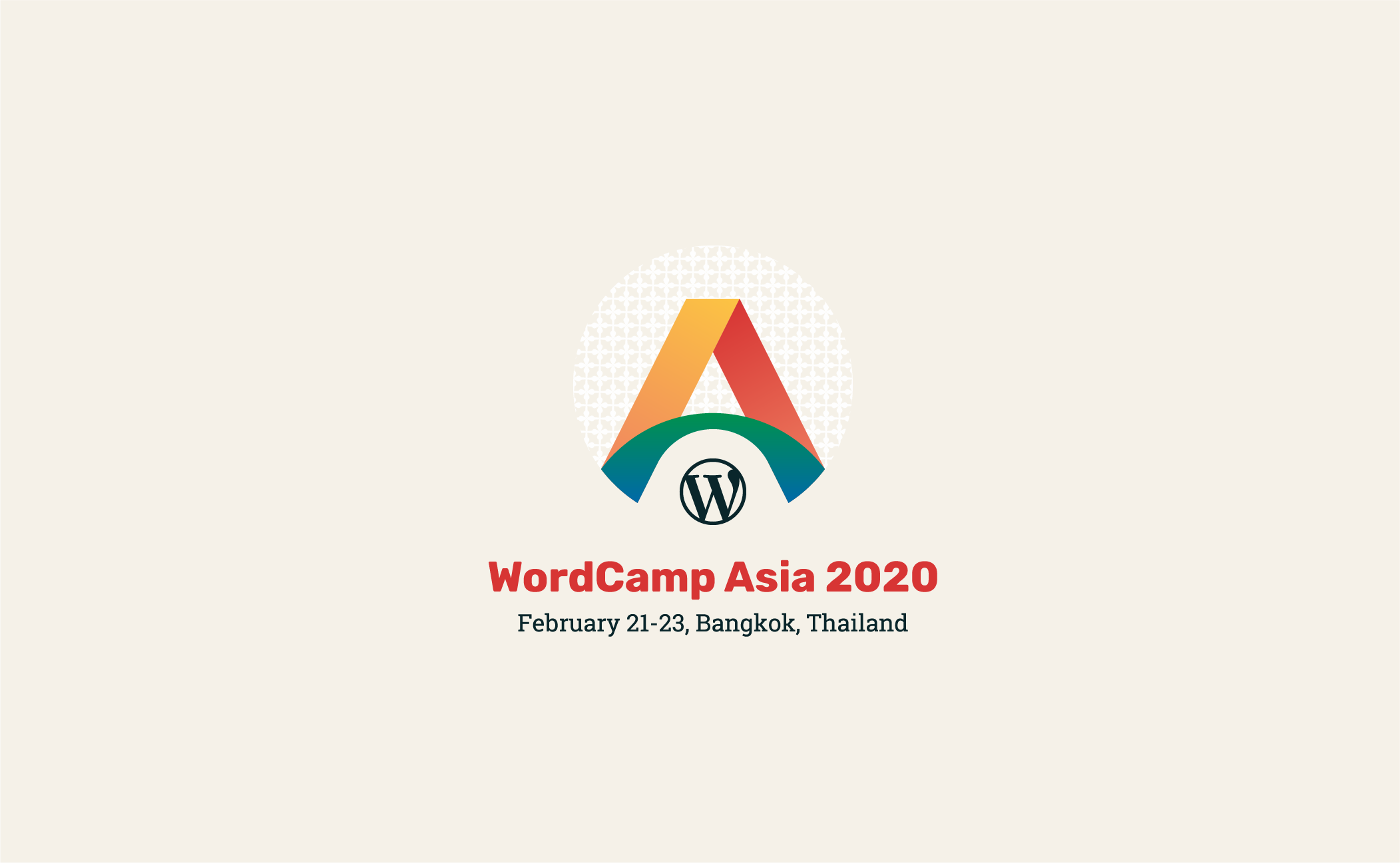
The Final Logo
As a final touch, a traditional Thai garland pattern is added as a background to further emphasize Bangkok flavour.
As to the font type, the design team decided to use ‘Rubik‘ font for Logotype and ‘Roboto Slab‘ font for body text.
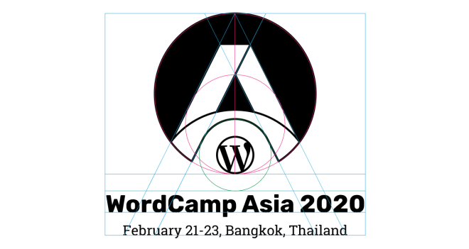
Behold, the final logo for the first flagship WordCamp in Asia!
Bonus: Logo Rank Score
The logo also received an overall high score of 95 (!!) from Logo Rank, and AI system that evaluates logo based on uniqueness, legibility, and colour contrast.
A huge round of applause for our design team members, Boy, Junko, and Daiya! ٩(^ᴗ^)۶
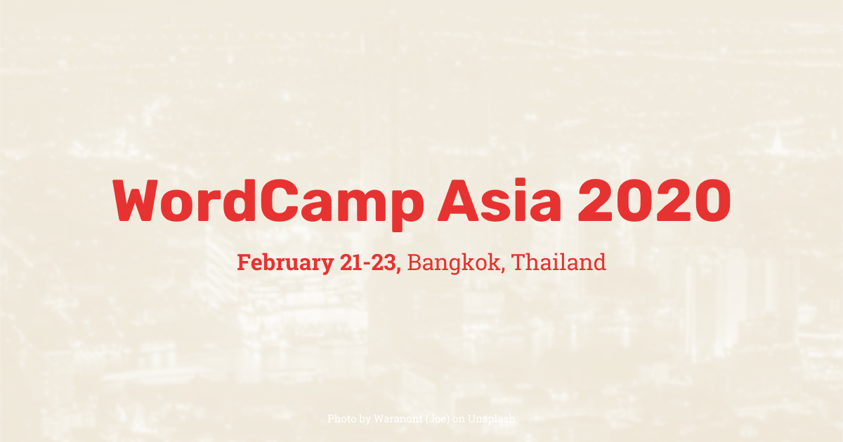
See you soon in Bangkok for WordCamp Asia 2020. Get your tickets now!
Excellent work! thank you for sharing.
Great work, beautiful logo!
Hi, It’s HitoriGS from Taiwan, I am a Media Partner of WordCamp Taipei 2019 and now applying the MP of WordCamp Asia. I would like to translate this LOGO design article into Traditional Chinese and post it to my website and introduce to Taiwanese WordPress society. May I translate it or I need do some apply? Is there anything I have to notice with the translation or using the pics of the article?
You can translate and post it. As for the WordCamp Asia MP, we will get back to you soon. Thank you
Amazing stuff, best of luck to WC Asia. Wish I cold go, so far away here in Costa Rica!!
Love this logo! Great work. I’m looking forward to the swag!
That’s cool! interesting colours 😀
Congratulations, this is a fantastic logo! Thank you for sharing the process – it really makes me appreciate the effort, skills and creativity that went into this. Well done! 👏
Excellent work. I love that logo. Woohoo! 🥳🥳🥳